
Staying ahead of color trends is crucial for children's wear brands aiming to captivate the market. As a manufacturer deeply embedded in the pulse of European and American children's fashion, we have unique insight into the evolving color palette that will define 2025. This article will unveil the forecasted popular colors, providing a strategic advantage for brands planning their future collections.
The most popular colors for children's wear in 2025 are a blend of soothing, nature-inspired hues and optimistic, energetic brights, reflecting a societal shift towards comfort, sustainability, and digital influence. This forecast is based on extensive analysis of runway trends, consumer behavior studies, and the directives of global color authorities like Pantone. Understanding these trends is key to creating collections that resonate with modern parents and children.
Let's dive into the specific color families that will dominate the children's wear landscape in 2025, helping you make informed decisions for your next sourcing order.
What Are The Top Earthy Neutrals For Kids' Fashion?
Earthy neutrals provide a timeless foundation for any children's wear collection. They are versatile, gender-neutral, and convey a sense of calm and connection to nature, which appeals strongly to today's parents. These colors are perfect for building a cohesive and mix-and-matchable core collection.
The top earthy neutrals for 2025 are Warm Sand, Moss Green, and Soft Clay. These shades move beyond basic beige and grey, offering warmth and depth. They are incredibly adaptable, pairing well with almost any other color and working across all garment types, from everyday knitwear to structured outerwear.

Why Are Warm Sand And Moss Green So Versatile?
Warm Sand is the new cornerstone neutral. It replaces stark whites and cool grays with a hue that is gentle on the eyes and evokes a sense of comfort and simplicity. Its versatility lies in its ability to serve as a clean canvas for prints and embroidery or to create elegant, standalone pieces. From a manufacturing standpoint, it's a forgiving color that maintains a premium look even after multiple washes, a key factor for parents seeking durability.
Moss Green bridges the gap between neutral and color. It is a grounded, soothing shade that connects children's fashion to the sustainability movement and a love for the outdoors. This color works exceptionally well in organic cotton and recycled polyester blends, aligning with the values of eco-conscious brands. Its versatility is proven in its seamless transition from casual baby bodysuits to more fashion-forward items for older children, making it a smart choice for a full-range collection. Understanding fabric choices is crucial, which is why working with an experienced children's wear manufacturer ensures the color is perfectly executed on the right materials.
How To Style Soft Clay In Seasonal Collections?
Soft Clay is a subtle, earthy pink with terracotta undertones that feels both nostalgic and modern. It adds a touch of warmth without being overly bold. For spring/summer collections, style Soft Clay in lightweight layers like linen-blend cardigans or cotton jersey tops. It pairs beautifully with crisp white and lighter denim for a fresh, sunny look.
For fall/winter, Soft Clay becomes a foundational color for cozy categories. Imagine it in plush fleece hoodies, soft sherpa-lined jackets, or corduroy pants. It complements deeper shades like chocolate brown and forest green, creating rich, autumnal color stories. This adaptability across seasons makes it a valuable asset for brands looking to build a consistent yet seasonally relevant brand identity. Ensuring color consistency across these different apparel fabrics is a core part of our quality control process at our factory.
Which Bright Colors Will Dominate In 2025?
While neutrals form the base, bright colors are the soul of a vibrant children's wear collection, capturing energy and joy. The brights of 2025 are digitally influenced and psychologically uplifting, designed to stand out both online and in real life. They are key to creating those must-have statement pieces.
Dominant bright colors for 2025 include Digital Lavender, Sunny Yellow, and Blissful Blue. These shades are chosen for their positive emotional impact and their high visibility in social media and digital marketing, a critical consideration for modern brands.
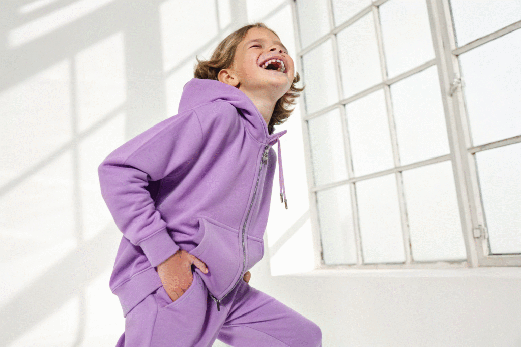
What Makes Digital Lavender A Standout Hue?
Digital Lavender has been identified by color experts as a color of wellness and digital harmony. It's a calming yet futuristic purple that is incredibly flattering on various skin tones. In children's wear, it offers a fresh alternative to traditional pink or pastel purple. Its "standout" quality comes from its unique position as a soothing bright—it captures attention without being overwhelming.
This color performs exceptionally well in sporty styles, graphic tees, and accessories. It also serves as a brilliant base for metallic accents and bold prints. For brands, using Digital Lavender signals a forward-thinking and mindful approach, aligning with the values of younger parents who are attuned to both aesthetics and well-being. We ensure this complex color is matched perfectly every time through our rigorous quality assurance protocols.
How Can Sunny Yellow Boost Brand Recognition?
Sunny Yellow is the epitome of optimism and energy. It is a highly memorable color that can significantly enhance brand recognition. When used consistently in logos, tags, or as a signature color in collections, it creates a strong visual association in the consumer's mind. It photographs brilliantly, making products pop in online stores and social media feeds.
Incorporate Sunny Yellow in raincoats, swimwear, and lightweight spring knits where its cheerful nature shines. It also works well as a contrasting color for trims, buttons, and graphic elements on more neutral garments. This strategic use of a high-impact color can differentiate your brand in a crowded marketplace. Effective use of color is a part of smart fashion branding that we support through our custom design services.
How To Mix And Match 2025's Color Palette?
Creating a successful collection is not just about individual colors, but how they work together. A well-curated color palette allows for endless mix-and-match possibilities, increasing the perceived value and versatility of your line for retailers and end-consumers.
The key to mixing 2025's palette is balancing the calm earth tones with the energetic brights. We recommend building your collection around a core of 2-3 earthy neutrals and then injecting 1-2 seasonal brights as accents. This approach creates a cohesive story that is both commercial and fashionable.

What Are The Best Color Combinations For Sales?
Certain color combinations consistently drive sales because they are visually appealing and easy for parents to style. Based on our experience supplying major brands, here are top-performing pairs for 2025:
| Combination | Target Use | Consumer Appeal |
|---|---|---|
| Warm Sand + Digital Lavender | Everyday Knitwear | Soothing, modern, and gender-neutral |
| Moss Green + Sunny Yellow | Outdoor & Playwear | Energetic and connected to nature |
| Blissful Blue + Soft Clay | Seasonal Collections (SS/FW) | Uniquely nostalgic and warm |
These combinations can be applied through block coloring, striping, or print placements. They offer a balanced look that is neither too loud nor too bland, hitting the sweet spot for the mid-to-high market segment.
Why Is A Cohesive Palette Key For Brand Identity?
A cohesive color palette is fundamental to building a strong and recognizable brand identity. It ensures that every piece in your collection, from a basic t-shirt to a statement jacket, feels like part of the same family. This consistency builds trust and loyalty with your customers, as they know what to expect from your brand visually.
When you source your manufacturing with a partner like us, we help you maintain this color consistency across all production runs and fabric types. Our expertise in color matching and management ensures that the Moss Green in your cotton knits is identical to the Moss Green in your woven jackets, solidifying your brand's professional image. This is a critical part of our apparel manufacturing service that protects your brand's integrity.
What Are The Key Factors Driving These Color Trends?
Understanding the "why" behind color trends allows brands to anticipate future shifts and make more strategic design decisions. The colors for 2025 are not arbitrary; they are a direct response to broader cultural, technological, and environmental forces.
The key factors are a collective desire for comfort and security, the influence of digital environments on our aesthetic preferences, and a deepening commitment to environmental sustainability. These macro-trends shape consumer psychology and, consequently, the colors they are drawn to for their children.

How Does Digital Culture Influence Color Choices?
Digital culture profoundly influences color trends. Colors that look good on screen—like Digital Lavender and Blissful Blue—are gaining prominence. The rise of social media and online shopping means a garment's first impression is often made through a digital thumbnail. Colors need to be vibrant and appealing in this context.
Furthermore, the "metaverse" and digital gaming aesthetics are trickling into physical product design, favoring bright, saturated, and slightly unconventional hues. Brands that understand this digital-first visual landscape can create products that are inherently "shareable," providing free marketing through user-generated content. Creating these on-trend pieces requires a supplier with strong design and development capabilities to translate digital trends into physical products.
Why Is Sustainability Shifting Color Palettes?
The sustainability movement is shifting palettes towards colors found in nature. Earthy neutrals like Moss Green and Warm Sand directly evoke a sense of the natural world, appealing to consumers who prioritize eco-friendly products. These colors are often linked to the use of organic dyes and sustainable materials, reinforcing a brand's ethical stance.
There is also a move away from heavily polluted dye processes. This makes naturally occurring, easier-to-achieve shades more desirable from both an environmental and marketing perspective. Partnering with a manufacturer that has robust compliance with international standards) ensures that the beautiful colors in your collection are achieved responsibly and safely.
Conclusion
The children's wear color palette for 2025 is a thoughtful and dynamic mix, designed to meet the moment. It balances the need for comfort and sustainability with the desire for joy and digital engagement. By integrating these forecasted colors—from the grounding earthy neutrals to the uplifting brights—into your designs, you can create collections that are both commercially successful and culturally relevant.
Ready to bring the colors of 2025 to life in your next collection? Partner with a manufacturer that understands the nuances of trend forecasting and delivers on quality and consistency. Contact our Business Director, Elaine, today at elaine@fumaoclothing.com to discuss how Shanghai Fumao can become your trusted partner in creating beautiful, on-trend children's wear that stands out in the market.