
Forecasting color trends for children’s summer collections requires balancing emerging fashion directions with timeless childhood appeal and practical parental considerations. As a manufacturer analyzing color trends for American and European markets, I’m seeing exciting evolutions that reflect broader cultural shifts while maintaining the joy and energy essential to children’s wear. The most successful palettes for 2026 will combine freshness with familiarity, creating collections that feel both contemporary and timeless.
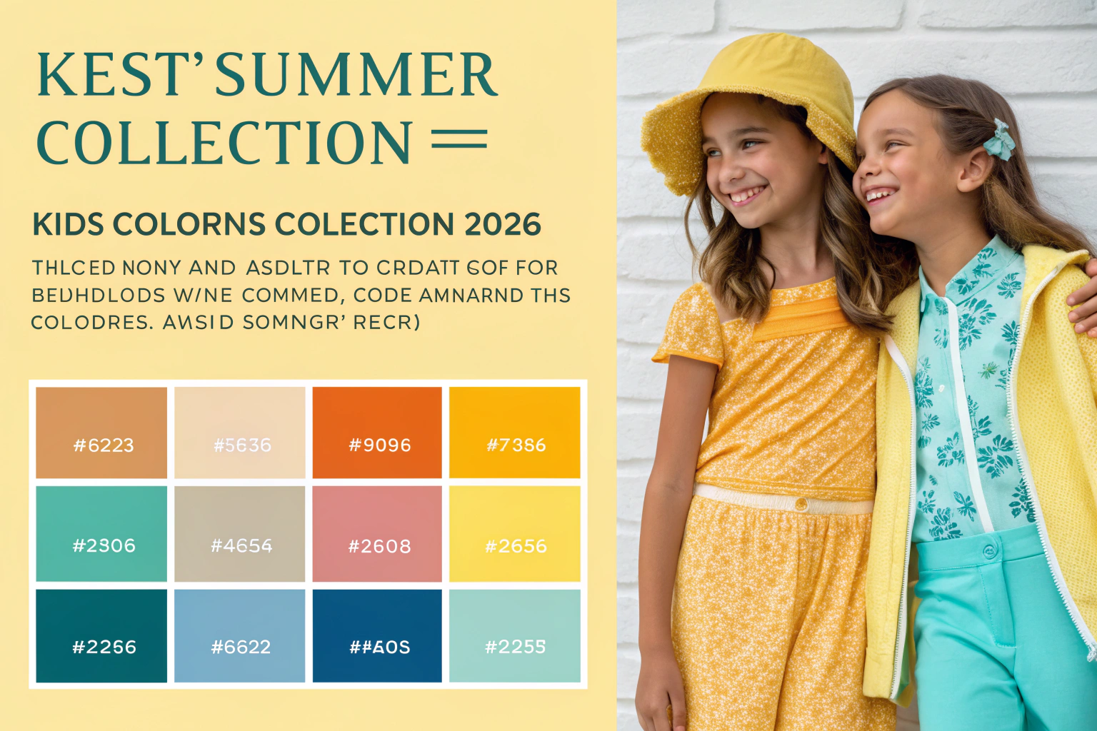
The best colors for kids summer collection 2026 include sunny citrus tones, cooling aquatic blues, earthy naturals, optimistic brights, and sophisticated pastels that collectively create balanced palettes supporting both playful energy and visual comfort. These color directions reflect growing interest in mood-enhancing hues, environmental connections, and gender-neutral appeal while maintaining the practical considerations of wearability and care.
The most forward-thinking approaches will use color not just as aesthetic choice but as strategic tool that supports brand positioning, addresses parental preferences, and creates emotional connections with young wearers.
Why Are Sunny Citrus Tones Dominating?
Citrus-inspired colors bring energy, freshness, and optimism to summer collections while offering excellent versatility across styles and demographics.
These zesty hues work equally well for both genders, photograph vibrantly for social media, and coordinate beautifully with core neutrals, making them commercially smart choices.

What Specific Citrus Shades Are Emerging?
Lemon zest (a clear, warm yellow), tangy orange (more saturated than coral), lively lime (brighter than traditional lime), and warm grapefruit (pink-tinged orange) represent the citrus spectrum for 2026. These colors feel fresher and more saturated than past citrus trends, reflecting a desire for optimism and energy after several challenging years. According to Color Trend Research, citrus tones are projected to represent 25-30% of summer 2026 children’s wear color stories.
How Do Citrus Colors Enhance Mood and Appeal?
The psychological impact of bright, warm colors creates automatic cheerfulness that appeals to both children and parents. These hues are particularly effective for playwear, swimwear, and special occasion pieces where energy and joy are priorities. Their high visibility also provides practical safety benefits for outdoor summer activities.
How Are Cooling Aquatic Blues Evolving?
Aquatic blues provide visual relief from summer heat while connecting to environmental themes and offering sophisticated yet playful appeal.
These cooling tones range from shallow water brights to deep ocean darks, creating versatile palettes that work across ages and styles.

What Aquatic Blue Variations Matter Most?
Lagoon blue (clear, medium bright blue), pool azure (slightly green-tinged bright blue), deep ocean (richer than navy), and sophisticated teal (blue-green balance) offer range within the aquatic family. These colors work particularly well for swimwear, beach cover-ups, and hot-weather separates where their cooling association provides both aesthetic and psychological benefits.
Why Do Aquatic Blues Support Sustainability Stories?
Water-inspired colors naturally connect to environmental themes, allowing brands to visually communicate sustainability values without explicit messaging. This subtle alignment with eco-consciousness resonates with parents who increasingly consider environmental impact in purchasing decisions. Aquatic blues also photograph beautifully against natural backgrounds, enhancing social media appeal.
What Role Do Earthy Naturals Play?
Earthy natural tones ground brighter colors while offering sophisticated neutrals that appeal to minimalist parents and provide versatility in mixing and matching.
These organic hues bring warmth and authenticity to summer palettes while supporting practical dressing through easy coordination.

Which Earthy Tones Are Most Versatile?
Warm sand (lighter than beige), stone gray (warmer than traditional gray), clay pink (muted earthy pink), and sunbaked terra cotta (rich orange-brown) offer sophisticated neutral options. These colors work beautifully as primary shades for more minimalist parents or as grounding elements in patterned pieces. Their practical advantage includes better dirt and stain camouflage than brighter alternatives.
How Do Earthy Colors Support Gender-Neutral Appeal?
Natural tones inherently transcend traditional gender associations, making them ideal for brands targeting gender-neutral positioning or families with multiple children of different genders. The Gender-Neutral Color Research indicates that earthy naturals are preferred by 65% of parents seeking gender-neutral options for their children.
Why Are Optimistic Brights Important?
Saturated brights provide energy and visibility while tapping into nostalgic references that appeal to both children and their parents.
These confident colors create immediate impact and joy while standing out in digital environments where much children’s wear is now discovered and purchased.

What Specific Brights Are Gaining Traction?
Cherry red (clear and saturated), electric magenta (blue-based bright pink), vibrant grass green (yellow-based green), and sunny daffodil (warmer than lemon) represent the bright spectrum. These colors work exceptionally well for statement pieces, accessories, and trim details where maximum impact is desired. Their high energy makes them perfect for playwear and vacation collections.
How Do Brights Enhance Digital Presentation?
In an increasingly online shopping environment, colors that pop on screen capture attention and communicate energy before customers read product details. Brights typically achieve higher click-through rates in digital marketing and perform well in social media environments where visual impact drives engagement. This digital advantage makes them commercially valuable beyond their aesthetic appeal.
How Are Sophisticated Pastels Evolving?
Updated pastels offer gentle contrast to brighter tones while providing softness that appeals to parents of younger children and special occasion purchasing.
These refined light colors bring sophistication to summer palettes while maintaining appropriate youthful charm.

What Makes 2026 Pastels Different?
Barely-there lavender (softer than traditional lilac), mint cream (warmer than classic mint), peach sherbet (less orange than traditional peach), and sky blue (clearer than powder blue) represent the evolved pastel palette. These colors have been adjusted to feel more contemporary and less traditionally gendered than pastel palettes of previous decades. Their sophistication makes them ideal for dressier summer occasions and photography.
Why Do Pastels Remain Commercially Important?
Despite trends toward brighter and darker colors, pastels maintain significant commercial appeal for newborn and toddler categories, special occasions like weddings and christenings, and parents who prefer softer aesthetics. They also provide visual relief in collections dominated by brighter shades, creating balanced assortments that appeal to broader customer bases.
Conclusion
The best colors for kids summer collection 2026 balance energy with sophistication, creating palettes that delight children while meeting parental preferences for versatility, wearability, and contemporary style. The most successful approaches will use color strategically to tell brand stories, create emotional connections, and drive commercial performance through thoughtful palette construction.
At Shanghai Fumao Clothing, we stay ahead of color trends through ongoing market research and close collaboration with our American and European brand partners. If you’re developing your summer 2026 collection and want to incorporate these color directions, contact our Business Director Elaine at elaine@fumaoclothing.com to discuss how our manufacturing expertise can bring your color vision to life.