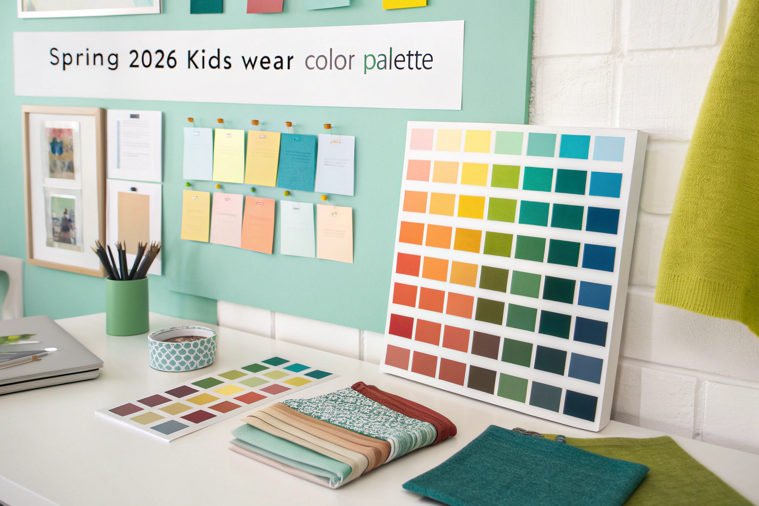
As we look toward Spring 2026, color trends in children's apparel are evolving to reflect a blend of optimism, environmental consciousness, and technological influence. Having worked with numerous brands on their seasonal color strategies, I've observed how color selection can dramatically impact a collection's market performance. The most successful palettes balance emerging trend directions with timeless appeal that resonates with both children and their parents.
The best colors for kids Spring 2026 collections will feature nature-inspired greens, soft digital blues, warm neutrals, and optimistic brights. These palettes reflect growing environmental awareness, digital lifestyle integration, and a renewed desire for joyfulness in children's fashion. The most successful collections will combine these trend-forward hues with commercial foundation colors that ensure broad market appeal across different regions and retail channels.
Understanding the cultural and psychological drivers behind these color trends will help you create collections that feel both fresh and commercially viable. Let's explore the specific color stories that will define Spring 2026.
What nature-inspired colors will dominate Spring 2026?
Nature-connected colors continue to strengthen their presence in children's wear, reflecting growing environmental awareness and a desire for grounding elements in increasingly digital lifestyles. For Spring 2026, these nature-inspired hues evolve toward more nuanced, sophisticated interpretations that work across multiple product categories and appeal to both urban and suburban markets.
The dominant nature palette includes Sprouting Green, Mineral Clay, Sunbeam Yellow, and Meadow Mist. These colors work harmoniously together while offering distinct personalities for different applications. Sprouting Green represents new growth and environmental optimism, while Mineral Clay connects to earthy, organic elements. The table below shows how these nature colors can be balanced within a collection:
| Color | Application | Emotional Connection |
|---|---|---|
| Sprouting Green | Statement pieces, outerwear | Growth, environmental optimism |
| Mineral Clay | Basics, bottoms | Earthiness, stability |
| Sunbeam Yellow | Accents, accessories | Joy, energy |
| Meadow Mist | Dresses, soft separates | Tranquility, softness |

Why will Sprouting Green be so important?
Sprouting Green will be crucial because it perfectly captures the intersection of environmental consciousness and optimistic forward movement. This mid-tone green has enough vibrancy to feel fresh and energetic while maintaining natural authenticity that appeals to eco-minded parents. According to Pantone Color Institute forecasts, greens in this family are gaining momentum across consumer goods, representing renewal and positive environmental action. For kids wear, Sprouting Green works equally well for both boys' and girls' categories and pairs beautifully with neutrals and brighter accents, making it incredibly versatile for collection building.
How do earthy neutrals balance brighter shades?
Earthy neutrals like Mineral Clay provide essential grounding that allows brighter colors to shine without overwhelming young wearers or creating coordination challenges for parents. These warm, approachable neutrals serve as the foundation of a collection, enabling easy mixing and matching while extending the wearable life of pieces across multiple seasons. The rise of minimalist parenting approaches has increased demand for versatile, coordination-friendly basics in these earthy tones that simplify dressing while maintaining style. These colors also photograph beautifully for digital marketing and social media, an increasingly important consideration for brands.
What digital-influenced colors are emerging?
The boundary between digital and physical worlds continues to blur in children's lives, influencing color preferences in unexpected ways. Rather than the harsh neon brights often associated with digital aesthetics, Spring 2026 sees the emergence of softened, more approachable tech-inspired hues that reflect how technology has become integrated into everyday life.
Key digital-influenced colors include Virtual Blue, Pixel Pink, Screen Glow, and Data Gray. These colors have a luminous quality that feels both contemporary and friendly. Virtual Blue represents connectivity and imagination, while Pixel Pink offers a playful, gender-fluid option that feels fresh and modern. These colors work particularly well for activewear, accessories, and statement pieces where their contemporary vibe can shine.
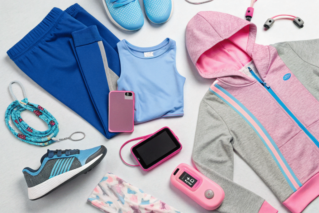
Why does Virtual Blue resonate with modern families?
Virtual Blue resonates because it represents both technological fluency and imaginative possibility—two qualities highly valued in modern childhood. This medium blue with subtle cool undertones feels both familiar and forward-looking, bridging traditional blue associations with contemporary digital contexts. Research from color psychology studies indicates that blues in this family promote feelings of calm and creativity, making them ideal for children's environments. The color's versatility allows it to work across gender categories and product types, from sophisticated layering pieces to playful graphic tees and accessories.
How are tech colors becoming more wearable?
Tech-inspired colors are becoming more wearable through subtle desaturation and the incorporation of human-friendly undertones that make them feel less artificial and more integrated into daily life. Instead of the intense electric hues of previous seasons, Spring 2026's digital palette features colors that have been softened with gray or warm undertones, making them easier to wear and coordinate. This evolution reflects how technology has become normalized in family life rather than standing apart as something separate or futuristic. These refined tech colors work well in performance fabrics where their contemporary feeling aligns with technical functionality.
What optimistic brights will capture attention?
Optimistic brights continue to play a crucial role in spring collections, bringing energy and joy to kids wear while appealing to children's natural color preferences. For Spring 2026, these brights evolve toward slightly more sophisticated interpretations that maintain their playful energy while offering better coordination potential with other palette colors.
The key optimistic brights include Joyful Orange, Playful Purple, and Sunshine Yellow. These colors work best as accents or in head-to-toe looks for maximum impact. Joyful Orange brings warmth and energy, while Playful Purple offers creative inspiration with its balance of cool and warm undertones. These brights are particularly effective for holiday and special occasion pieces within the spring collection, as well as for accessories that can update core items.
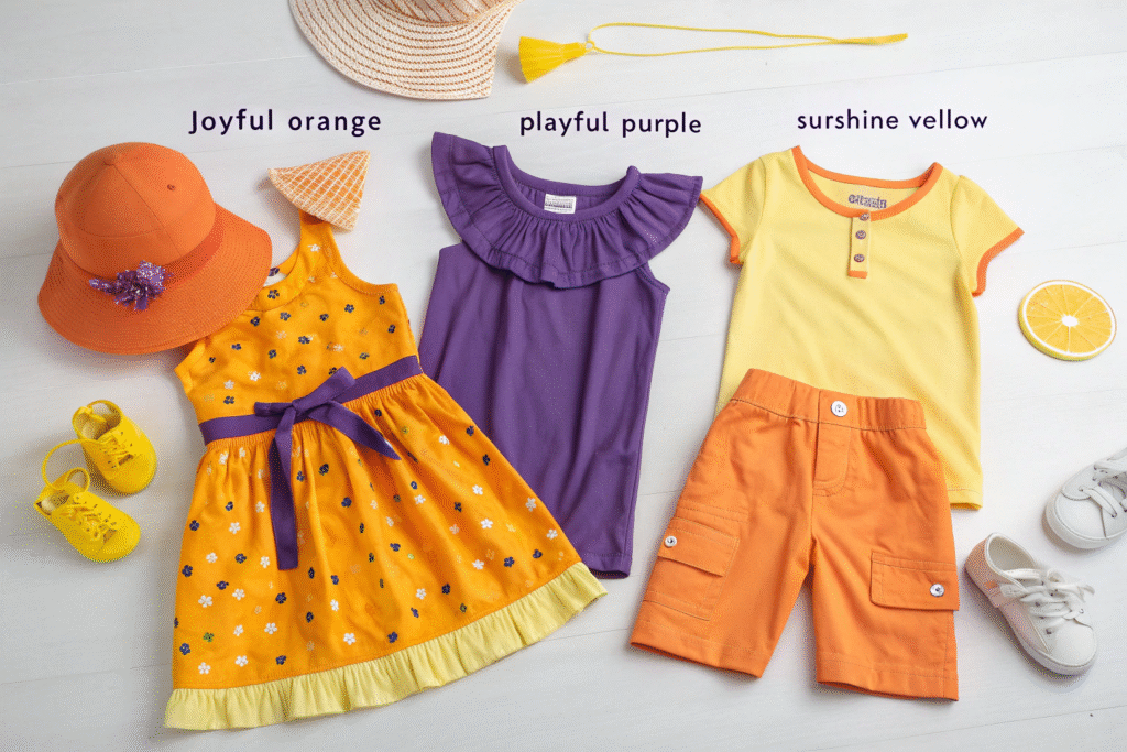
Why does Joyful Orange generate emotional connection?
Joyful Orange generates strong emotional connection because it combines the energy of red with the friendliness of yellow, creating a hue that feels both exciting and approachable. This particular orange has enough warmth to feel nurturing while maintaining vibrant energy that appeals to children's sense of fun. According to consumer color response research, orange stimulates enthusiasm and creativity while being less aggressive than pure red, making it ideal for children's products. The color's association with citrus fruits and sunny days gives it natural spring relevance that feels both timely and emotionally uplifting after winter months.
How can brights be balanced for commercial success?
Brights achieve commercial success when balanced through careful distribution across a collection rather than dominating entire assortments. The most effective approach uses brights for 20-30% of a collection, focusing them on statement pieces, accessories, and items where their emotional impact delivers maximum value. Brights work particularly well when paired with the earthy neutrals and digital blues discussed earlier, creating dynamic color stories that feel both exciting and wearable. This balanced approach allows brands to capture the attention-grabbing benefits of bright colors while maintaining the commercial practicality that ensures strong sell-through rates across the entire collection.
How should colors be distributed across a collection?
Strategic color distribution is essential for creating cohesive collections that appeal to both consumers and retailers. The most successful Spring 2026 collections will balance trend-forward colors with commercial foundations, ensuring both fashion relevance and broad market appeal. Understanding how to allocate colors across different product categories and price points maximizes both creativity and commercial performance.
An effective color distribution strategy uses a 50-30-20 approach: 50% foundation neutrals, 30% seasonal fashion colors, and 20% statement brights. This ratio ensures coordination flexibility while delivering the color excitement that drives spring purchasing. Foundation colors should dominate basics and core items, while fashion colors and brights work best in fashion pieces and accessories where they can generate excitement without limiting wearability.
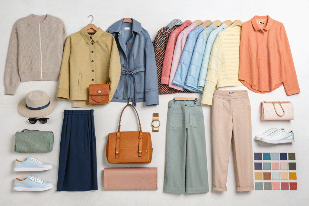
What foundation colors ensure commercial stability?
Foundation colors like Soft White, Mineral Clay, and Data Gray ensure commercial stability by providing the wearable basics that anchor a collection and drive repeat purchases. These colors typically represent 40-50% of sales volume, making them critical to a collection's financial success. According to retail sales data analysis, neutrals consistently outperform in children's wear because they simplify dressing for parents and extend garment wearability across multiple seasons. These foundation colors work across all product categories but are particularly important in basics like tees, leggings, and simple dresses where wearability and coordination take priority over fashion statements.
How can color stories create collection cohesion?
Color stories create collection cohesion by grouping colors into intentional combinations that tell specific visual narratives. For Spring 2026, successful color stories might include "Digital Garden" (Virtual Blue + Sprouting Green + Data Gray), "Sunrise Explorer" (Joyful Orange + Sunbeam Yellow + Mineral Clay), or "Meadow Dream" (Pixel Pink + Meadow Mist + Soft White). These curated combinations help retailers visualize merchandising opportunities and assist parents in creating coordinated looks. Well-developed color stories also strengthen brand identity and make marketing communications more impactful by creating recognizable visual signatures across multiple product categories and marketing channels.
Conclusion
Spring 2026 kids wear colors reflect a cultural moment balancing environmental consciousness, digital integration, and optimistic joy. The most successful collections will combine Sprouting Green, Virtual Blue, Mineral Clay, and Joyful Orange in thoughtful distributions that balance fashion-forward appeal with commercial practicality.
Understanding both the emotional resonance and commercial application of these colors will help you create collections that resonate with modern families. If you're developing your Spring 2026 line and need manufacturing expertise to bring your color vision to life, contact our Business Director Elaine at elaine@fumaoclothing.com. Let Shanghai Fumao's experience with seasonal color trends help you create commercially successful collections that capture the spirit of the season.